I led the design of post-transactional communication experiences for Home Depot PRO customers, addressing split deliveries and other pain points in their journey. The new research-driven design was well received and solved critical pain points for the customer and business alike. Additionally, I developed new UX guidelines, style guide, and modern design components for Home Depot communications.
• Product and design strategy
• Interaction designs & conceptualizing
• User research studies and interviews
• Usability studies
• Analyze qualitative and quantitative data
• Design execution
• Sketch
• Usertesting.com platform
• Jira
• HotJar
• Email Acid

Home Depot's PRO customers in the residential construction industry face challenges with post-transaction experiences. The problem arises when their orders are occasionally split into multiple deliveries due to low inventory or operational issues. Customers receive partial deliveries without comprehensive visibility into the status of their entire order, significantly disrupting their business activities.

For two weeks, I conducted research with Home Depot store associates and PRO customer support specialists to gain insights into prevailing customer pain points. Collaborating closely with stakeholders and product owners, I delved into Home Depot's operations concerning partial deliveries, reschedules, changes in ETA, and delays.
Through comprehensive research, I gained a profound understanding of the pain points concerning deliveries in general. The findings from this study played a pivotal role in identifying split delivery as a crucial touchpoint in the customer journey.
Learn feedback and experiences shared by PRO customers regarding their delivery experiences.
Identify key pain points and challenges PRO customers face during store delivery.
How can we enhance delivery experiences using communication strategies?
Split deliveries rarely work in the favor of the customer.
I am unable to plan staffing due to my state regulations.
It is rare that store associates would communicate to the customer of a split.
Split delivery orders get pushed between stores causing delays in delivery.
Drivers do not provide enough drop-off time for customer.
I just received my delivery but there are items missing. Where are they?
When something comes out of FDC, the order will not be a split delivery.
When order split happens, we need make the customer aware of it ASAP.
Drivers do not pick up the order or contact the customer.
Shortage in quantity- we can only do another delivery based on the next available date.
Customers want to know the delivery ETA as soon as they place an order.
Split delivery is a problem, especially when it is not scheduled.
The design work was conceived based on carefully analyzing research findings and valuable business insights. By leveraging this information, I formulated several hypotheses to build the design solutions and validate them through usability studies.
Note: I have used current Home Depot brand guide, icons, components and templates.
Proactively communicating with PRO customers about delivery changes creates awareness, reduces frustrations, enables better planning, and lowers service center calls.
I researched extensively and collaborated with store associates, customer support, and various stakeholders to uncover a need for new communication for split delivery.
Highlight: When an order splits into multiple consignments within the Home Depot ordering systems, this communication would be triggered immediately and sent to the customer.
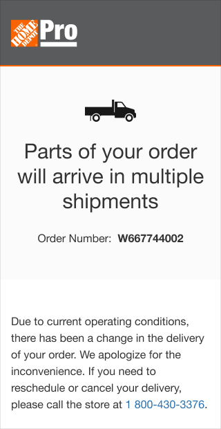
Offering detailed order item sections and specific delivery details to PRO customers enhances insights, enabling individual item tracking and improving the order-tracking experience.
Through close collaboration with product owners from diverse teams, I gained valuable insights into the data sources within the ordering systems and understood their origins.
Highlight: Partnering with the engineering team, I focused on ensuring seamless retrieval of payload data from various systems to present an accurate order status.
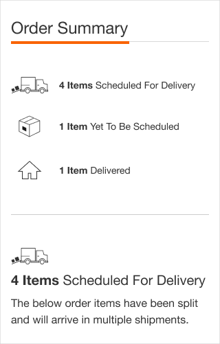
By offering separate order item sections with delivery details, we will improve PRO customers' order status insight and enable them to track each item individually. This enhanced visibility is expected to significantly improve PRO customers' understanding of their order status, enabling more effective business planning.
With the ability to retrieve payload data from diverse systems, I successfully facilitated the presentation of individual order items. The design layout showed individual shipments in sections with tracking and delivery details.
Highlight: Collaborating with the delivery UX team, I advocated the proposed solution and recommended implementing specific components in the delivery experience. These enhancements aim to provide customers with a seamless and improved end-to-end understanding.

Understand how customers perceive the communication approach.
Evaluate if the various shipping states provide a clear overview of their orders.
Assess if customers have a clear understanding of multiple shipments and items.
Measure customer satisfaction using attitudinal metrics such as appearance, loyalty, and credibility.
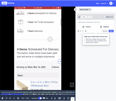
The entire study can be found here- DFS Split Delivery Study
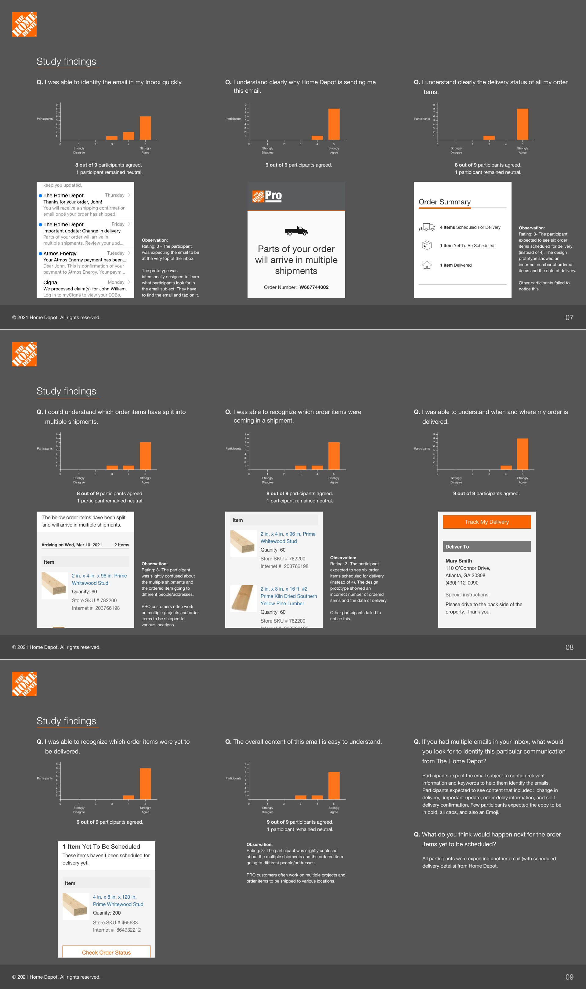
Most participants clearly understood their order was split into multiple deliveries.
All participants welcomed the holistic overview of the order summary were able to understand when and where their order was delivered.
Few participants found the email lengthy.
This timely communication could save business costs by reducing customer support calls and helping customers plan around partial deliveries.
I initiated this project to revamp Home Depot communications, focusing on creating a fresh and appealing look and feel that would deliver a more impactful customer experience. Collaborating closely with the ECC UX team, I developed foundational design guidelines for reproducing UI components and patterns, prioritizing accessibility, usability, and modern aesthetics.
Stakeholders and cross-functional teams well received the newly proposed designs.
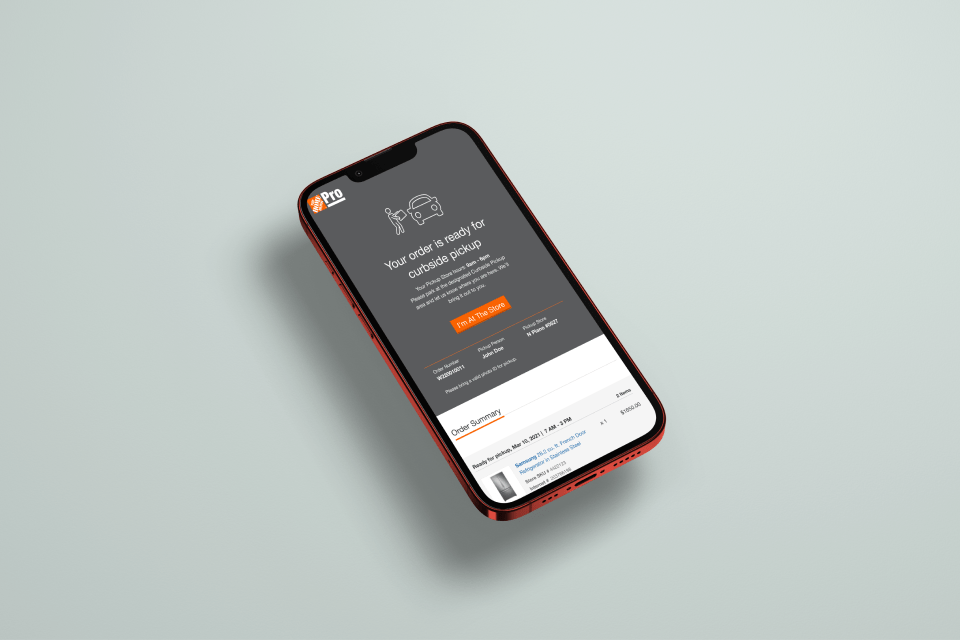
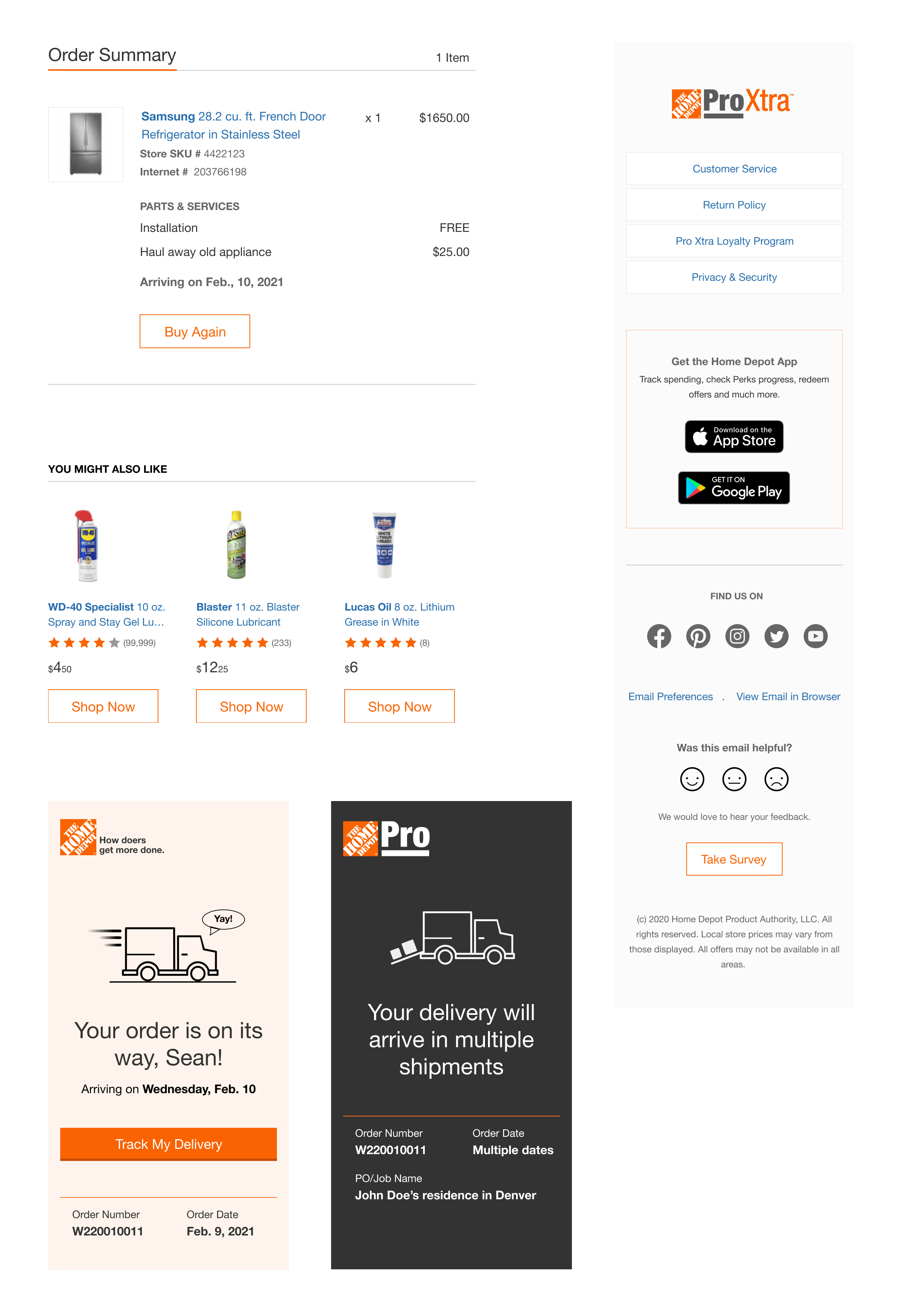
I enjoyed my role at The Home Depot, as it provided a fresh vertical to apply UX principles. I had the opportunity to devise innovative design solutions that addressed critical challenges for a leading home retail enterprise. By introducing new guidelines for Home Depot communication and proposing modern, accessible, and usable designs, I succeeded in instilling brand value.
Overall, I was pleased to make contributions toward the million+ communications that occur annually between The Home Depot and its valued customers.