I led the digital experience for Health Mart products across web and mobile platforms. I successfully conceptualized a high-value pharmacy staffing tool from scratch, empowering customers to plan their pharmacy operations efficiently. Furthermore, I devised impactful UX improvements for critical initiatives at McKesson and fostered a user-first approach while collaborating with stakeholders to ensure optimal user experiences.
• Product design strategy and execution
• Design concepts and interactive prototypes
• Usability studies and interviews
• Digital style guide creation
• Evangelize user-centric practices
• Sketch
• InVision
• Jira
• Trello
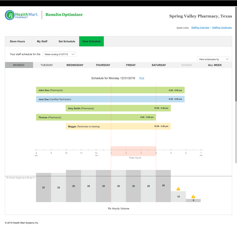
Health Mart are independent and locally-owned pharmacies. Owned by McKesson, Health Mart has a competitive advantage in offering various products and incentives that benefit brick-and-mortar pharmacy businesses. Pharmacy staffing is a critical aspect of daily planning and operations.
Pharmacy store owners need help managing their workforce and meeting customer demands. The complexity of running a successful pharmacy arises from inadequate staff planning and the need to adhere to stringent regulatory requirements. Finding practical solutions to address staffing issues, ensure regulatory compliance, and optimize pharmacy operations for enhanced customer satisfaction is essential.
I inherited the staffing scheduler, design layouts, and limited data from another cross-functional team within McKesson. The brand loyalty of McKesson was negatively impacted.
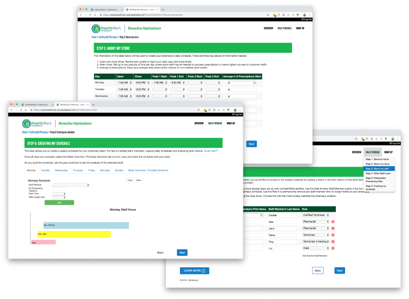
I performed a cognitive walkthrough to assess product usability, gaining insights into end-users optimal outcomes. By thoroughly examining all tasks, we understood the complexities and planned for solutions that met our user's needs and goals.
• User flows were complex, which led to high abandonment
• Poor discoverability of features.
• Lack of Health Mart/McKesson brand seen through.
What were the main pain points and challenges faced by store owners in workforce planning?
What is the current feedback and user experience regarding the staffing scheduler?
Are there any regulatory constraints that may affect the staffing scheduler's functionalities?
Product is too complex to use.
I am unable to plan staffing due to my state regulations.
Store owners like to see weekly and monthly calendar for store operations.
Store hours can vary along with peak hours for any given week.
Need to maintain and keep track of the Rx volume daily, weekly, and monthly.
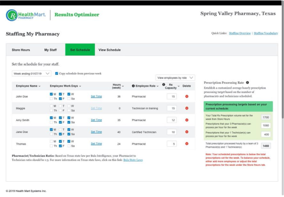
Weekly staff plan helps in setting prescription processing rate.
Store owners usually print weekly schedules and have it on display in their back-office.
Stores frequently host visiting pharmacists, who are not employees.
Staffing is critical for pharmacy operations.
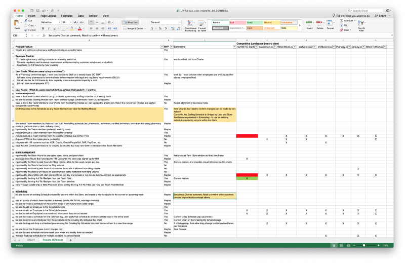
In conceptualizing the McKesson staffing tool, meticulous attention was devoted to capturing and understanding the diverse user requirements. By engaging with SMEs, product owners, and business stakeholders, we discerned the pressing user needs, which include optimized staff allocation to meet varying customer demands, seamless adherence to intricate regulatory standards, and a user-friendly interface that promotes ease of use and accessibility. The tool's development was driven by synthesizing these critical insights, ensuring that it not only addresses the complexities of workforce management but also offers an intuitive and effective solution tailored to the unique challenges of the pharmacy industry.
I dedicated considerable time to conducting whiteboard sessions and collaborative meetings with the team. Throughout the process, we gained a shared understanding of the ideal user workflow and proactively addressed the significant unresolved issues.
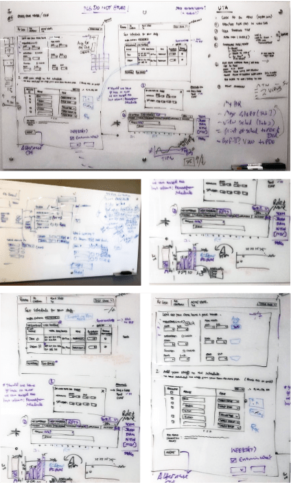
After whiteboard brainstorming, I translated our ideas into functional design prototypes. We saved time by establishing most workflows during low-fidelity designs. The resulting design solutions addressed vital features, enabling pharmacists and store owners to plan staffing, set peak hours, manage prescription volumes, and account for visiting pharmacists and technicians.
Daily and weekly calendar views offered a comprehensive overview of the staffing schedule. Additionally, we successfully addressed mapping prescription hourly value to peak hours, a critical aspect for effective prescription planning.

Enabling staff enrollment, defining roles, working hours, peak times, and prescription volume allocation streamlined stores' operational planning. The product was designed to ensure store owners planned as per regulatory state laws and met staffing requirements effectively.
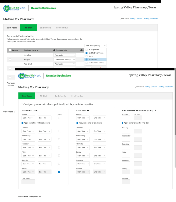
Pharmacy owners can control prescription processing hours, set prescription volumes, and efficiently plan staffing schedules. The product automatically calculated the prescription processing rate, empowering store owners to optimize their scheduling practices effectively.
At McKesson, meeting pharmacy store owners was a significant challenge. To gauge the effectiveness of the designs, I had to conduct research with internal stakeholders and SMEs who have vast healthcare experience or have been past pharmacy owners.
As I approached my departure from McKesson, a usability study was conducted with a few pharmacy store owners. The product owner led the study to validate the new staffing tool.
Users reported a better understanding of the scheduler features, and found the newly designed flow easier to schedule their staff.
Users expressed appreciation for the staff schedule chart, enabling seamless management.
The scheduler ensured compliance with governing laws, keeping users in regulation.
Effectively plan their staff's prescription needs weekly.
Users saw potential cost savings by eliminating the need for third-party products.
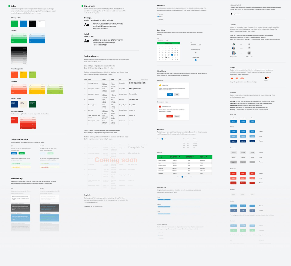
When I started at McKesson, I observed products that lacked cohesiveness, featuring inconsistent visuals and experiences. Recognizing the importance of a unified digital design, I took the initiative to create a comprehensive digital style guide aimed at bridging the visual gap across the products.
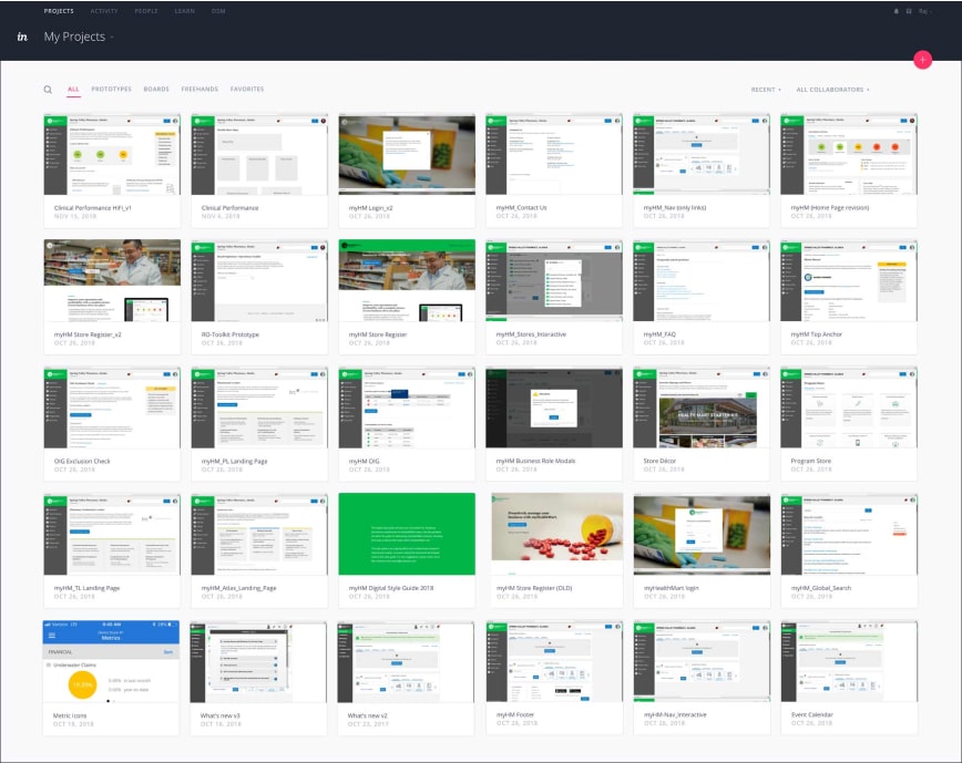
With an inventory of all UI components of the product, I had the essential building blocks to create a digital style guide for Health Mart products. I ensured consistency across the design system using typefaces and colors from McKesson and Health Mart brand guides.
Healthcare is a challenging vertical for UX practice.
At McKesson, it was even more challenging owing to the inability to conduct research with actual pharmacy store owners, and a limited user-centric driven environment for developing digital products. Despite these constraints, I embraced the challenge and successfully crafted solutions while advocating for the significance of UX to cross-functional teams and stakeholders.